Easter Sunday at Springs Church
Motion Graphics
Typography
Design Problem:
Capture a the accurate essence of Easter through the written word, expressed in a conceptual, coherent visual voice.
Use strictly typography to express meaning and feelings, avoiding imagery as a crutch.
Using motion graphics and typography, let people feel something before they read a single word
4th Year Student Work

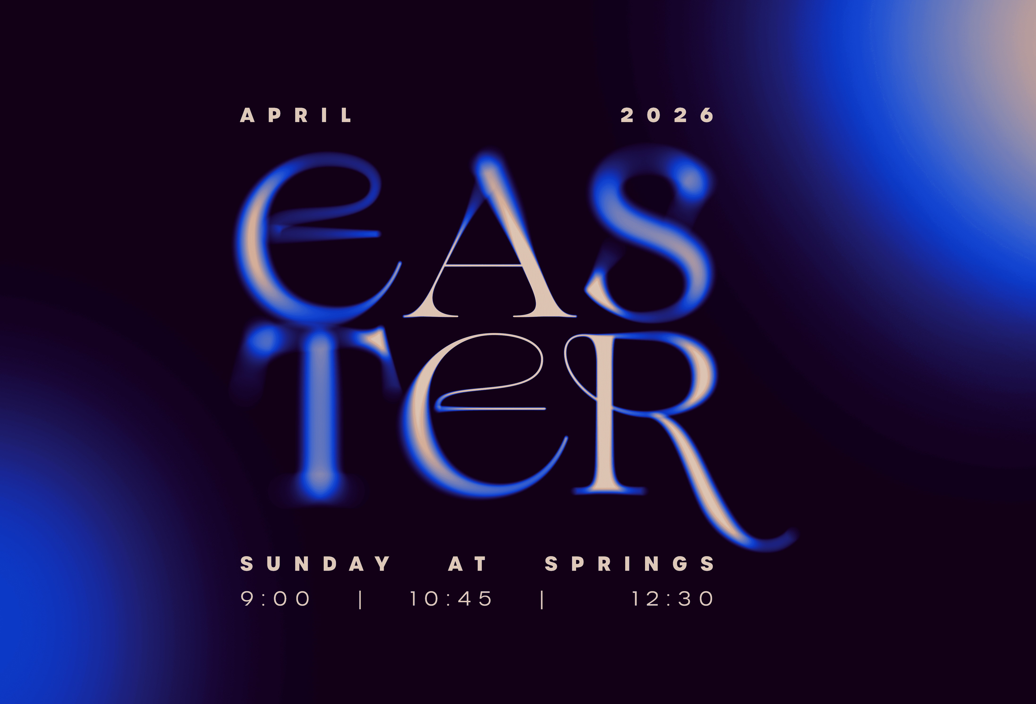
Big Screen Motion Graphic:
Project Framework:
I've found that modern christian churches have some of the inventive typographic and spatial design explorations to draw from, while also having a lot of room to do something genuinely fresh and unexpected. But at times, they can miss the moral message while trying to look like the "cool church."
Church lives in a unique tension where they want to feel welcoming and accessible while still conveying depth, meaning, and ultimately…Jesus.
Environmental design can represent these things simultaneously in a way that a logo or a bulletin never could. And as Easter and Good Friday approached, I felt it was a special opportunity as a designer to create an digital asset that conveyed the right energy at easter.
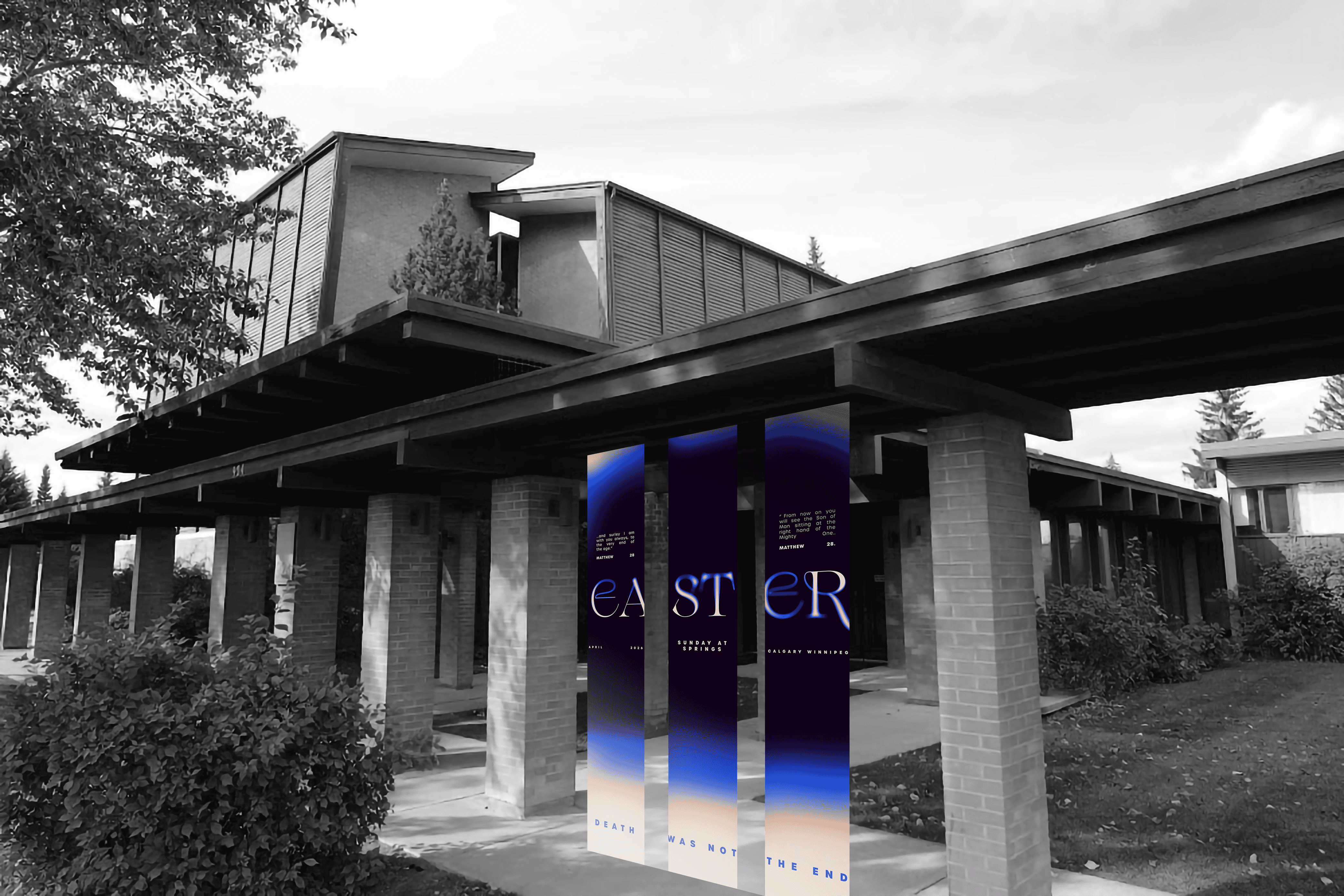
Banners outside the building:
Design Decisions:
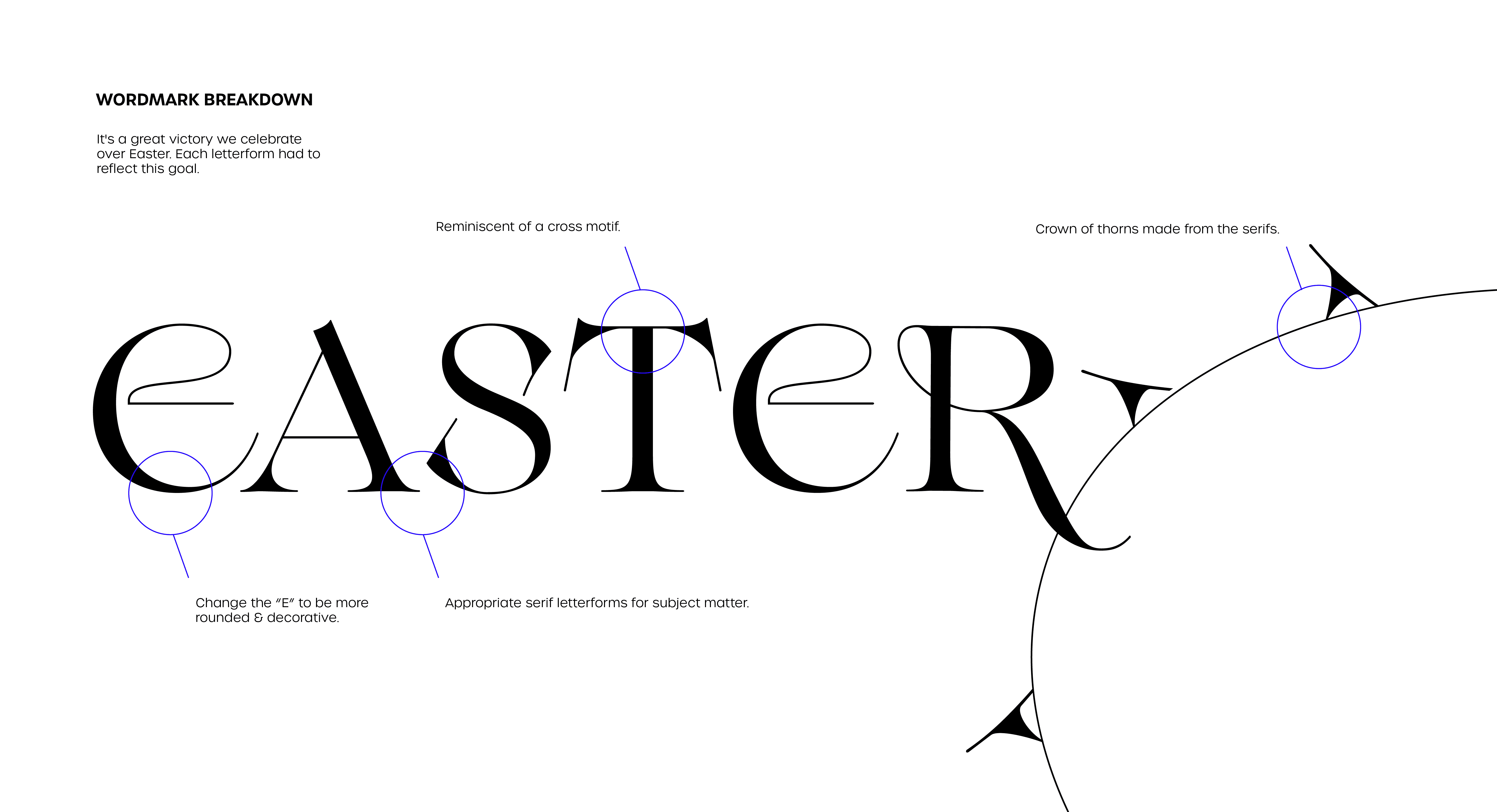
The experimentation process revealed the value customizing typefaces holds. Lots of emphasis was put on customizing letters forms and using each to speak outside the word word 'easter'.
To create something stark and monumental, I chose to be confident with sizing. This evokes a transcendent, weighty,
awe-inspiring voice. Works especially well in sanctuary spaces
with height and light. Like an old style church used to capture.The customized modern typeface makes the graphics aligned with the Spring's Church positioning. Keeping the church feeling deeply communal instead of just making something that looks aesthetic for social media.
Word Mark Breakdown:
Smaller TV Still: